
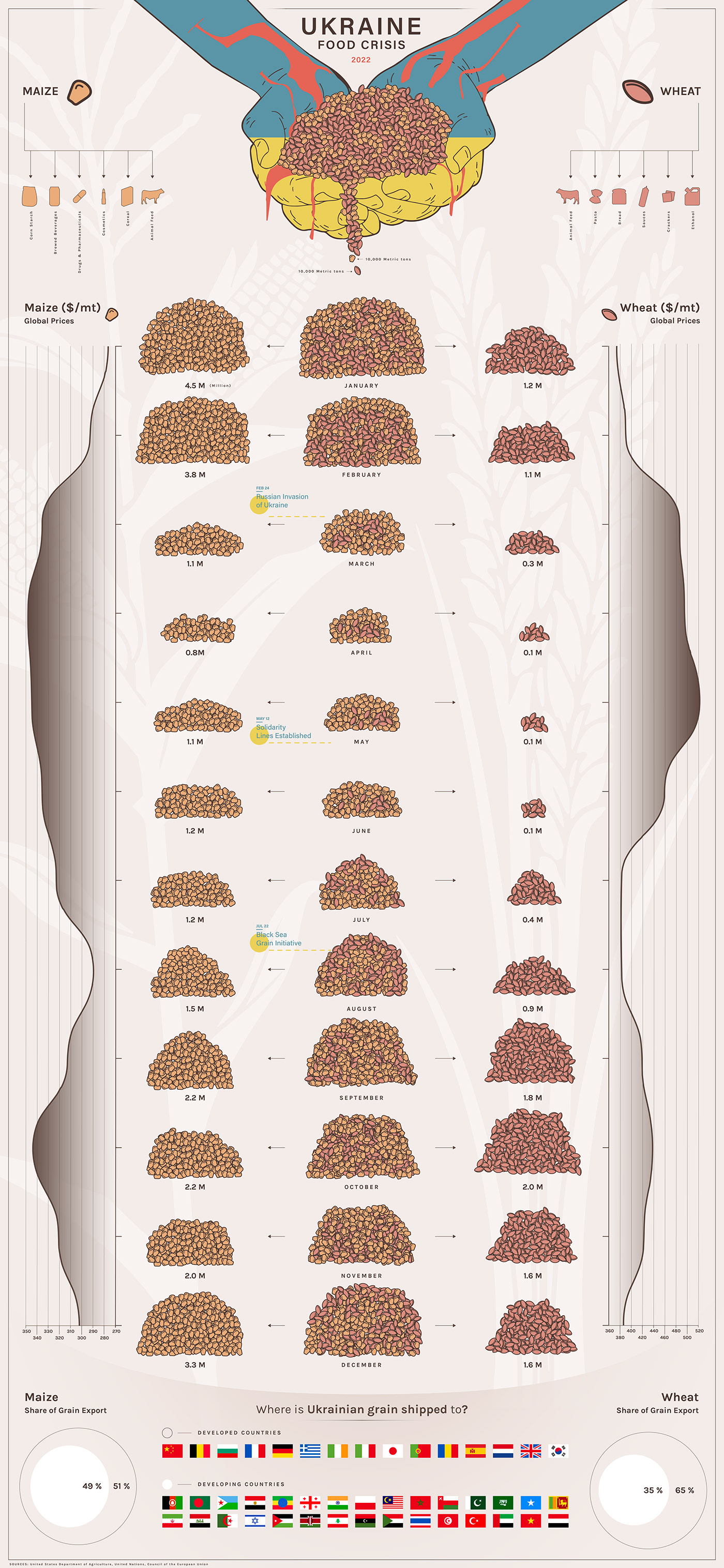
For our third and final semester project, we were tasked with creating a visualization for which we could choose our own data set and topic. We started searching for a topics with the mindset that we would choose the topic with the most data. However, after some research and deliberation, we decided to create a story surrounding the Russian and Ukrainian War that started in early 2022. With this in mind, we started our journey to find a dataset that we felt had not been represented and could give us a new perspective on what was happening. Joe quickly found that Ukraine is one of the biggest exporters of major grain products like barley, maize, and wheat. With this in mind, we found our data and started our sketches and iterative process. Initially, we approached this topic from an industrial perspective utilizing imagery such as a truck delivering packages down a conveyor belt. However, after some discussion we found that it would be best to approach the topic from a humanistic perspective. Therefore, we wanted to evoke an agricultural feel through the use of earth tones in the color palette and illustrating hands as well as individual grains of wheat and corn. We wanted a viewer to empathize with this timeline of a significant drop in grain production and how it influenced global prices. As the timeline progressed, it showed each individual month and the amount of wheat/maize that were exported. In addition to this, we thought it would be interesting for a viewer to see where these crops are exported with both developed and developing nations. We essentially decided to focus on maize and wheat as they were the top two exports and could show a stronger and deeper narrative of the effects of the Ukraine War.
By Peter Grissom and Joseph Neus

